Layout
Layout design
Matkahuolto’s identity is to be reflected in all layout design to improve clarity and usability. Consistency in design enhances the experience and builds a strong, recognisable and visually appealing brand identity.
Consult this page for best design tips.
Tips for design
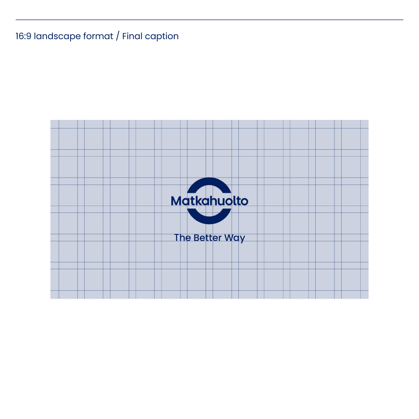
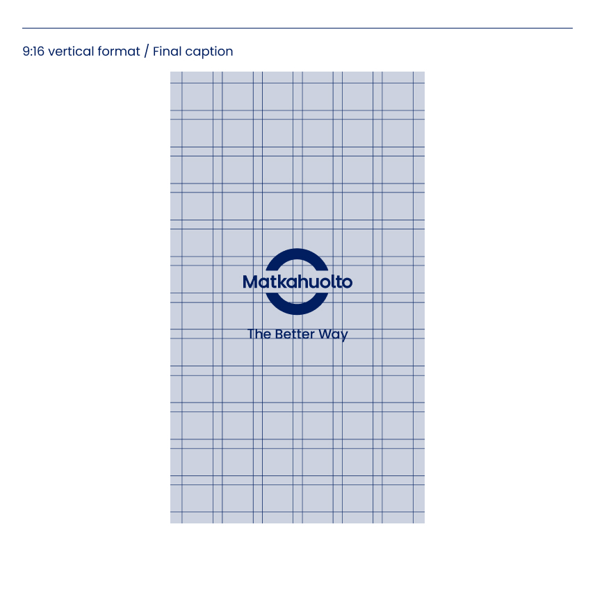
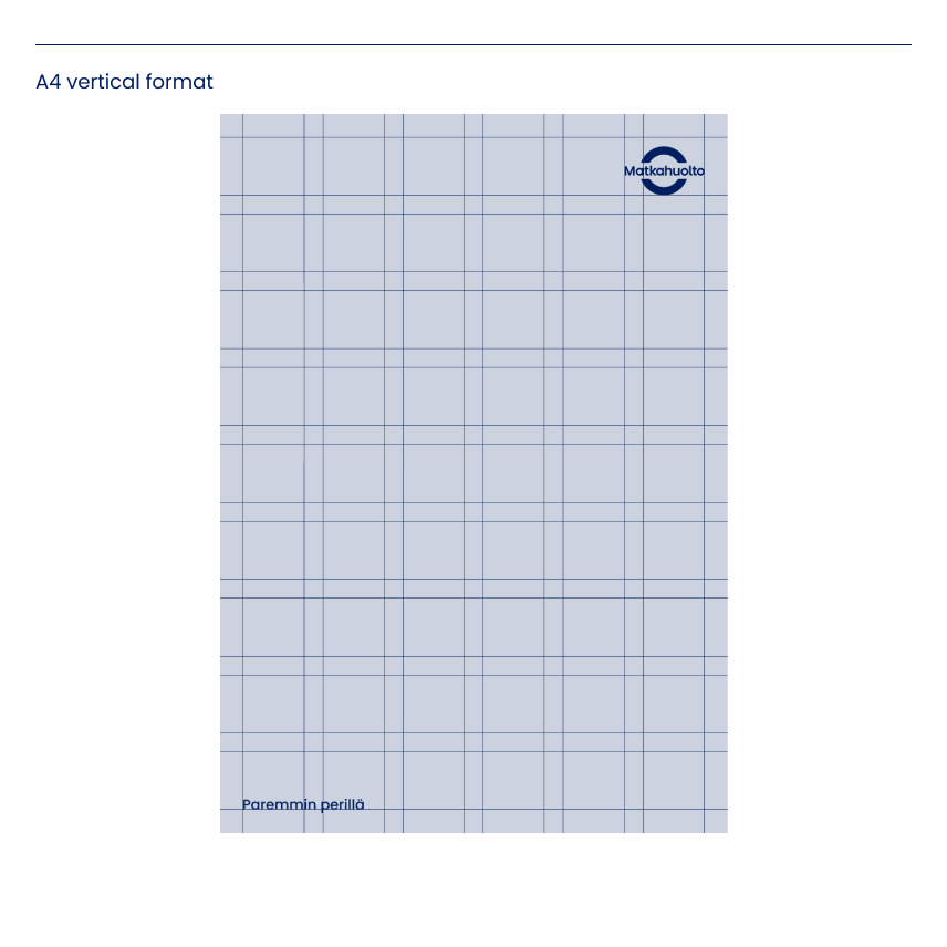
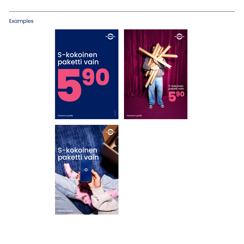
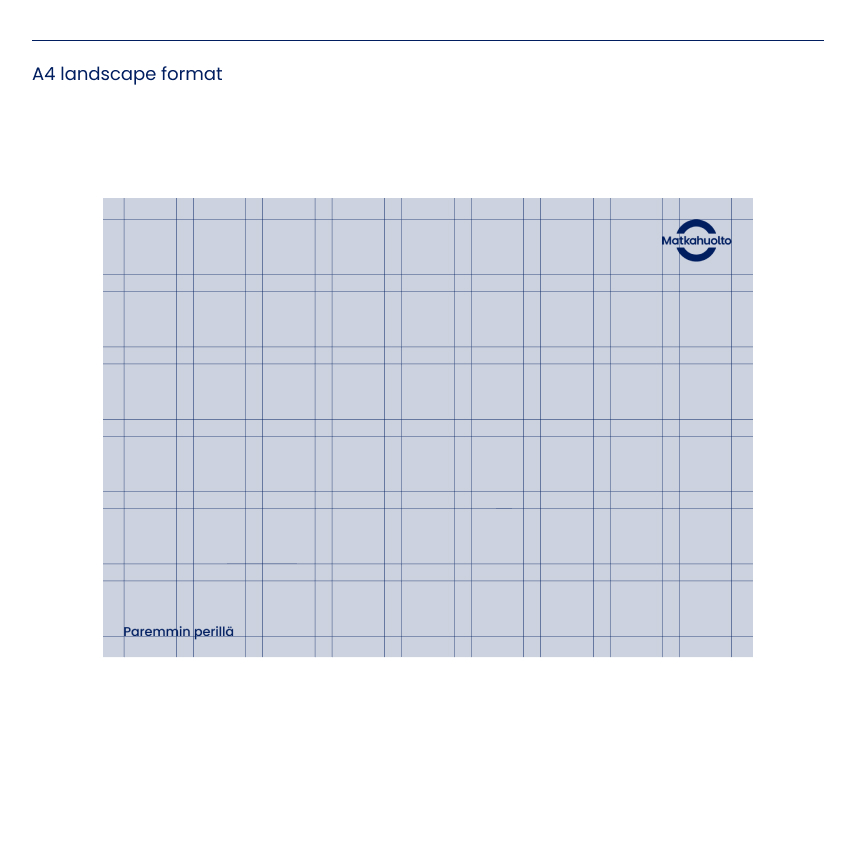
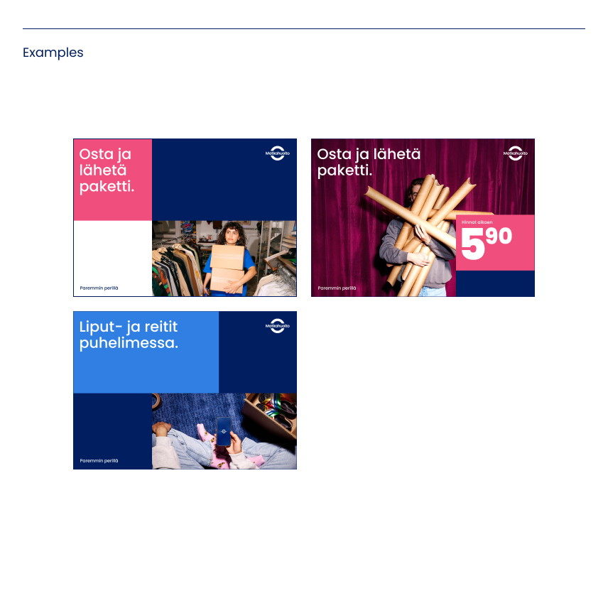
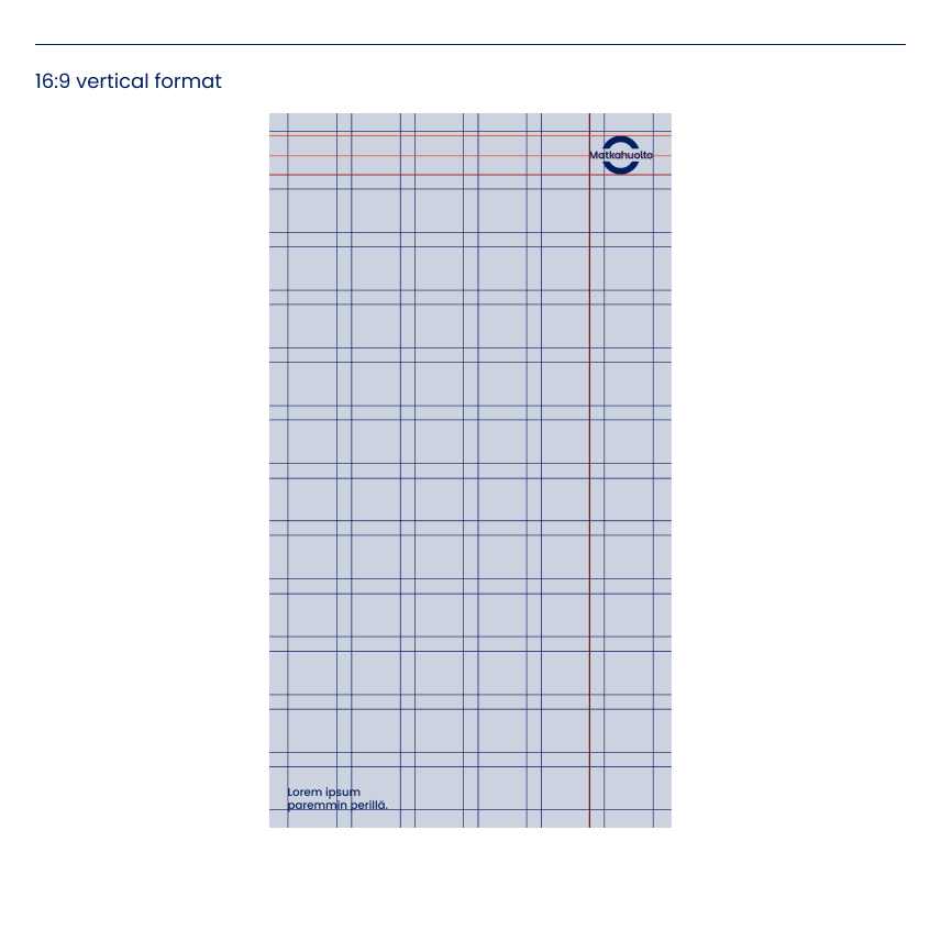
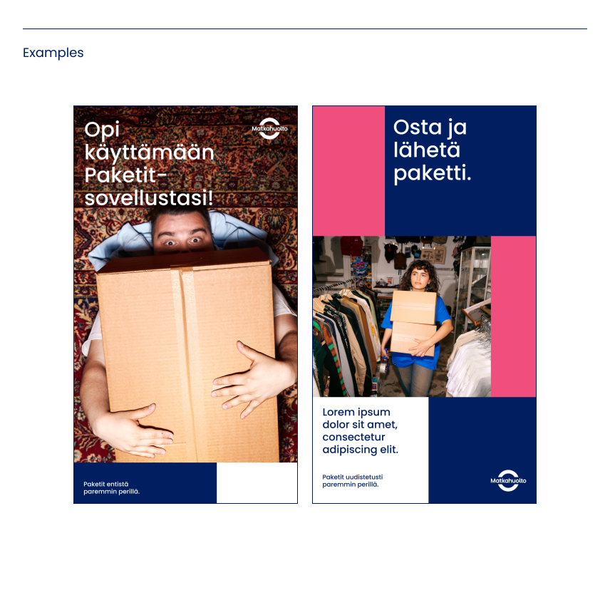
Always follow the ground rules and instructions set out in the graphic guidelines. To support the design of the layout, help grids have been created for the most common vertical and horizontal formats, along with examples of how to use them.
As a general rule, the same guidelines and principles should be followed when designing print and digital content. However, you should always take into account the specific requirements of the content and the environment in which it will be used.
Final caption
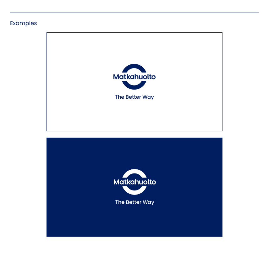
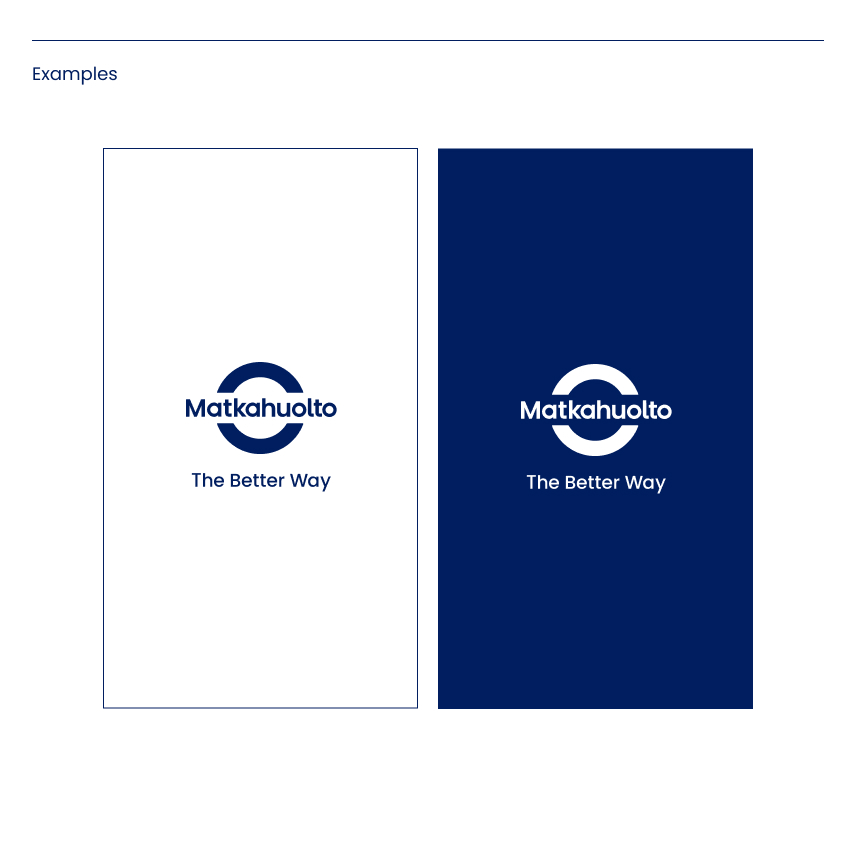
Final caption means the last scene of a moving image, or ‘outro’, which is typically reserved for the Matkahuolto logo.
The final caption can be shown on a white or blue background. It is advisable to use the logo recommended for use with the slogan.
