A clear-cut colour scheme represents Matkahuolto and its two business units in an authentic and consistent way. Guidelines are issued for the use of identity colours in different contexts.
Brand colour values
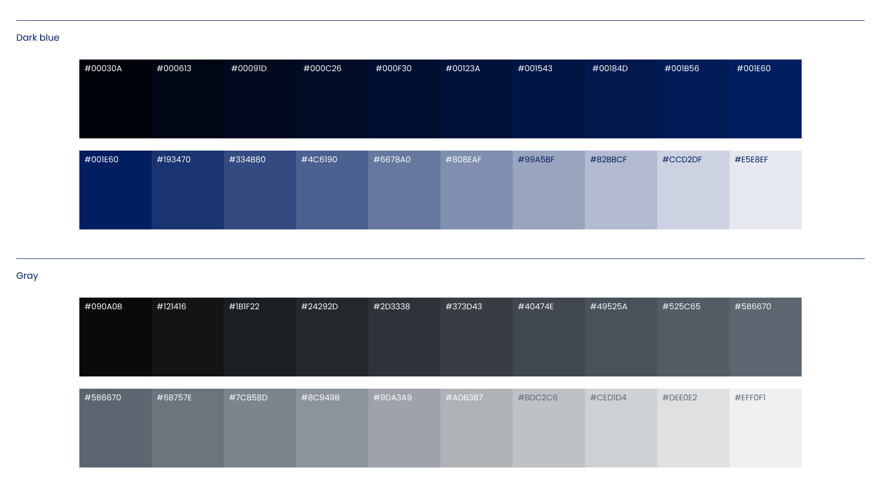
Dark blue
HEX #001E60 RGB 0/30/96
CMYK coated 100/85/0/45 CMYK uncoated 100/85/0/35 CMYK newspaper 90/70/0/30 PMS 2757 C / PMS 281 U
A basic principle for the use of colours on graphic surfaces and in textual contexts has been defined to ensure consistency and recognisability:
Matkahuolto, generic: Dark blue + White + Grey
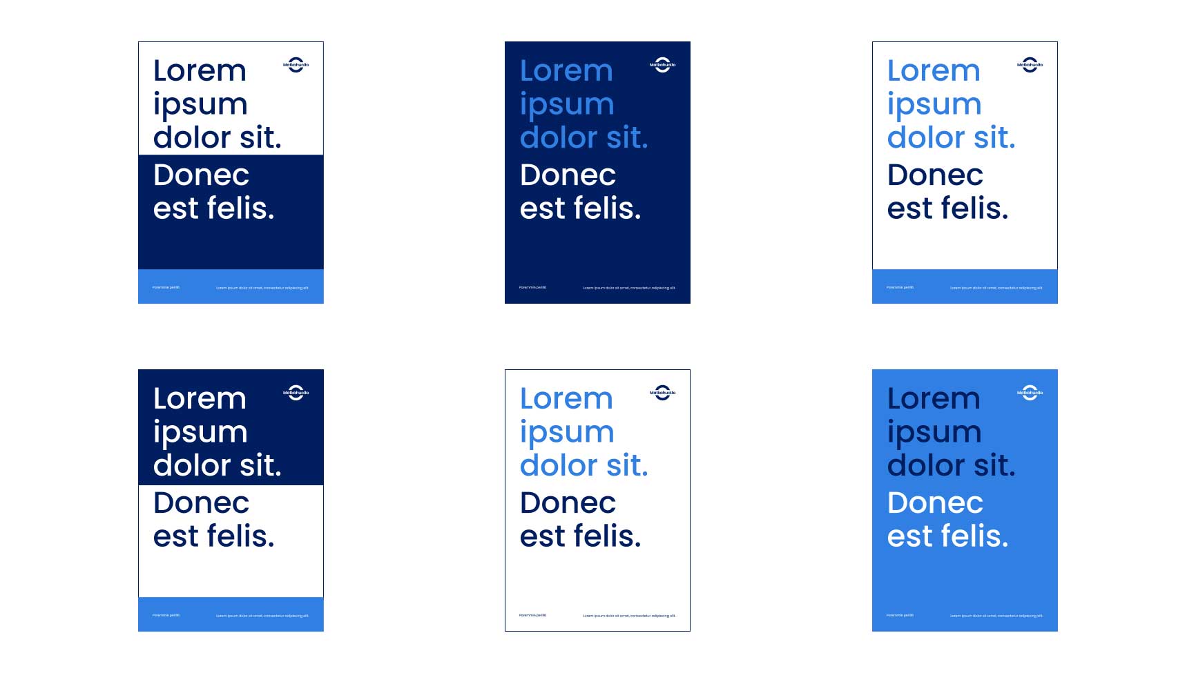
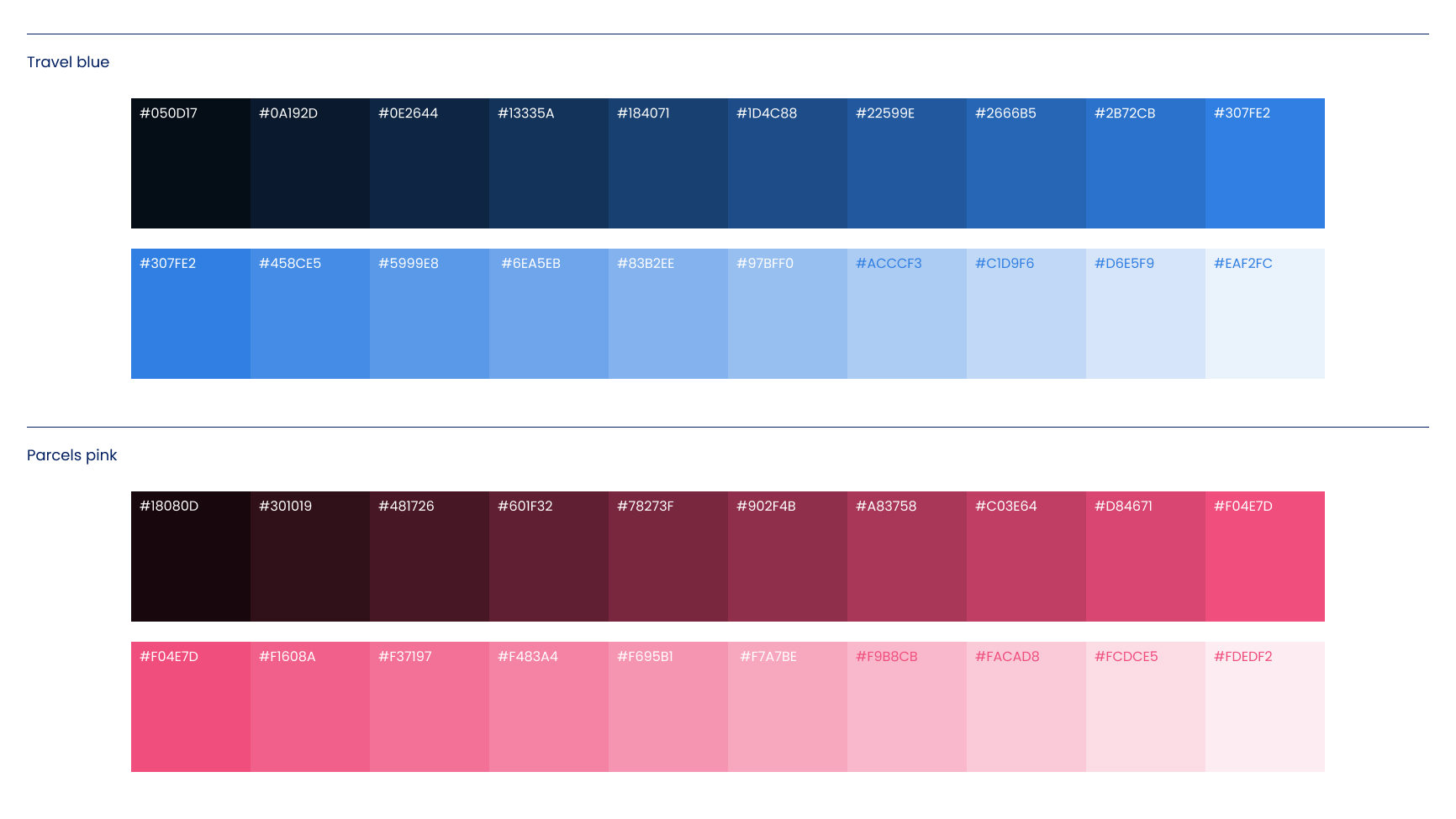
Matkahuolto, Travel: Dark blue + White + Travel blue
Matkahuolto, Parcels: Dark blue + White + Parcels pink
As a general rule, colours should be used as compact solid shades over large areas, and as highlights in headlines or more suggestive elements. Due consideration should be given to the context and message content when designing the rhythm and order of colours.
Example of the use of Travel colours
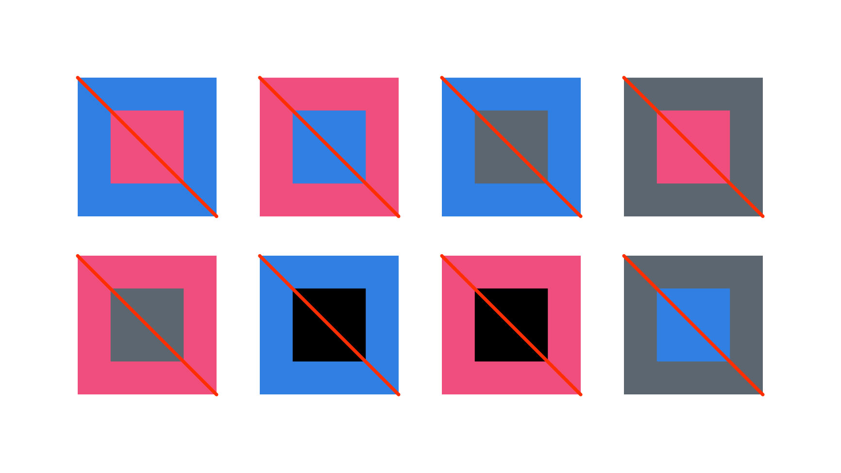
Disallowed colour combinations
Additional colours
A range of additional colours have been specified for Matkahuolto that may only be used in specific subject-related contexts. These colours may only be used in combination with Matkahuolto’s generic colours. Please remember that the logos may never be re-coloured.
Matkahuolto’s sustainability
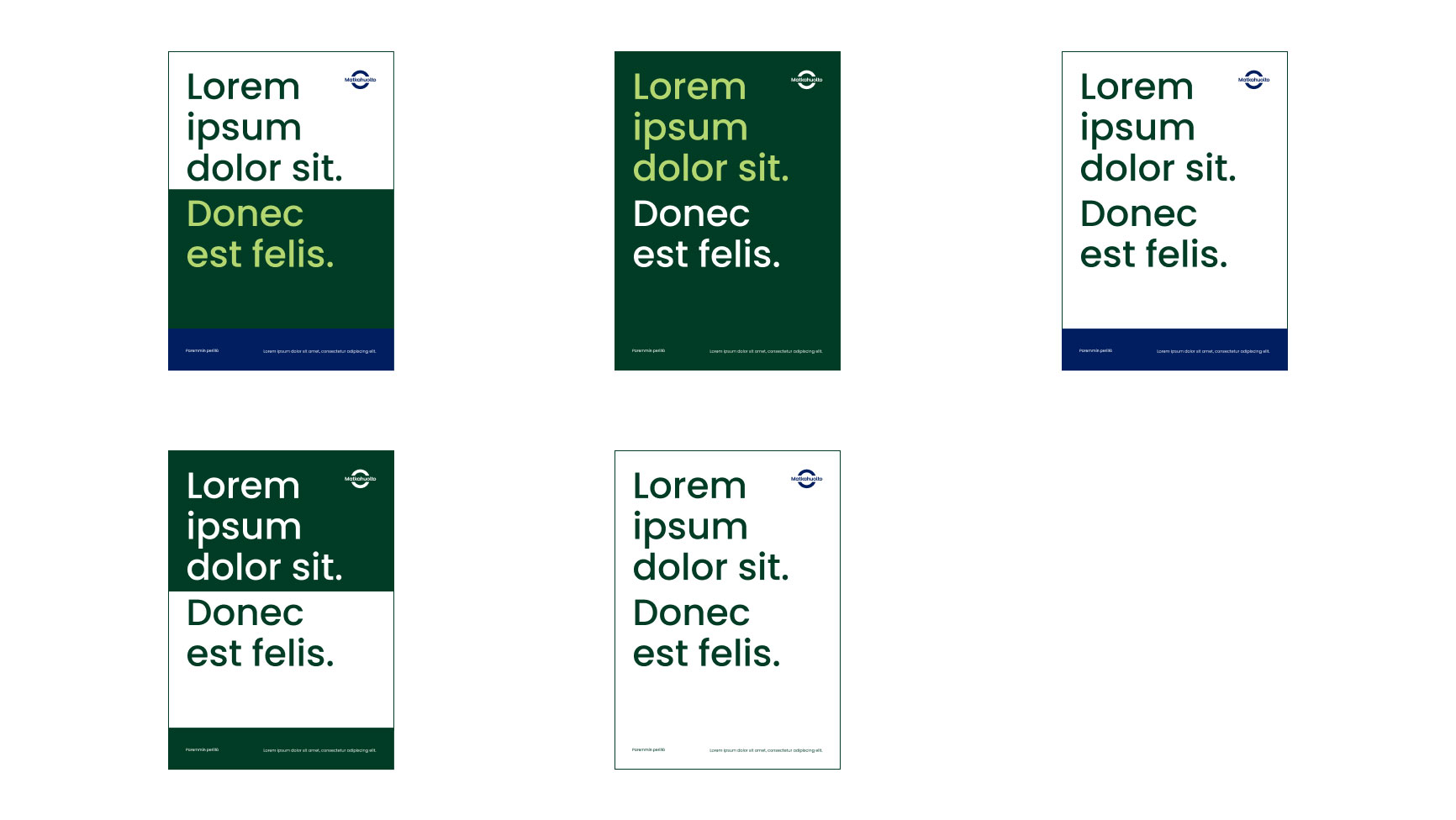
Shown below are the sustainability-related shades of green and examples of how to use them.
Sustainability dark green
HEX #003C25 RGB 0/60/37
Sustainability light green
HEX #B4D670 RGB 180/214/112
Recommended use of sustainability colours
Digital context
The use of colours in digital interfaces has a direct impact on the user experience. Colours create a sense of identity, provide guidance and help perceive the structure of the user interface.
Shown below are the additional colours that may be used in digital environments and examples of how to use them.
Brand colours in a digital environment
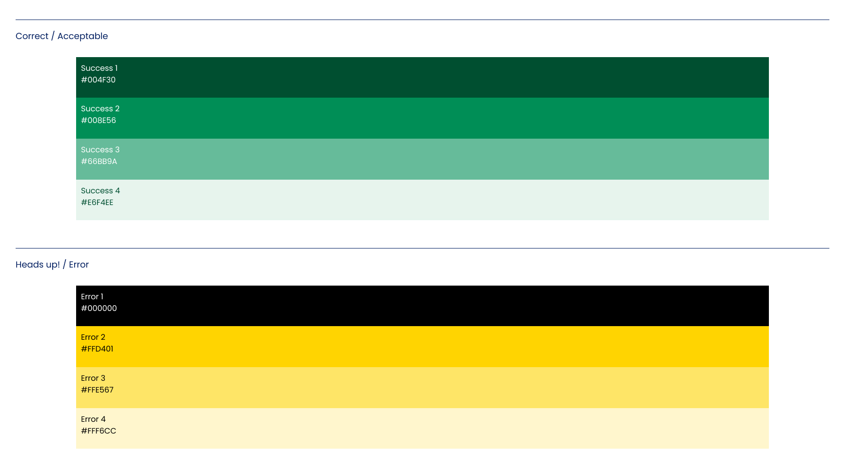
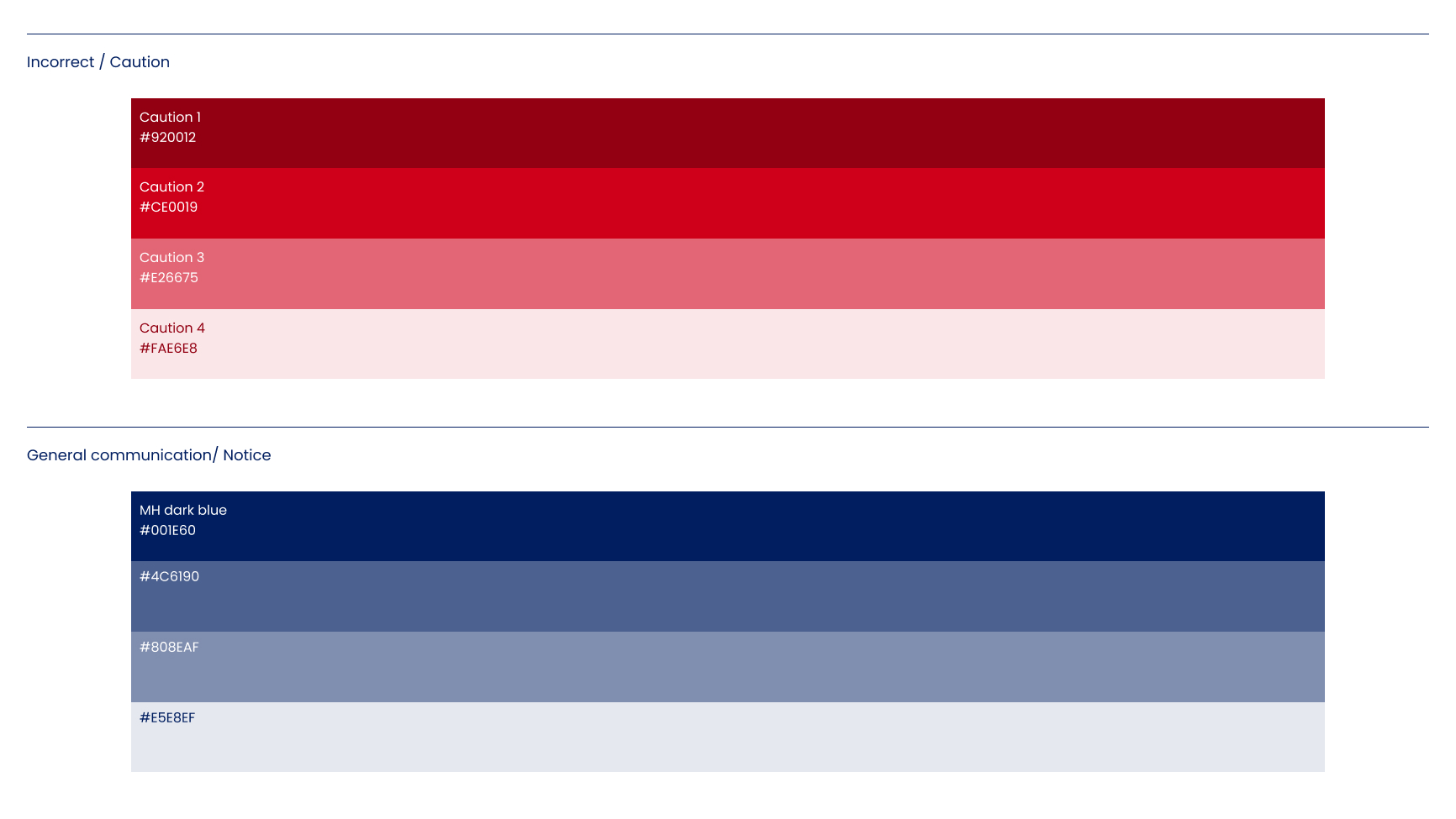
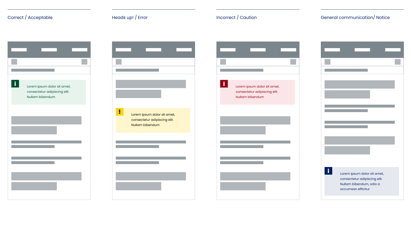
Functional colours
Examples of the use of functional colours
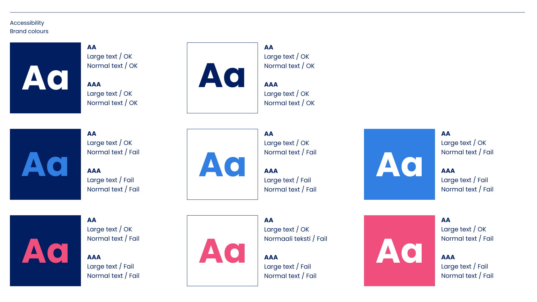
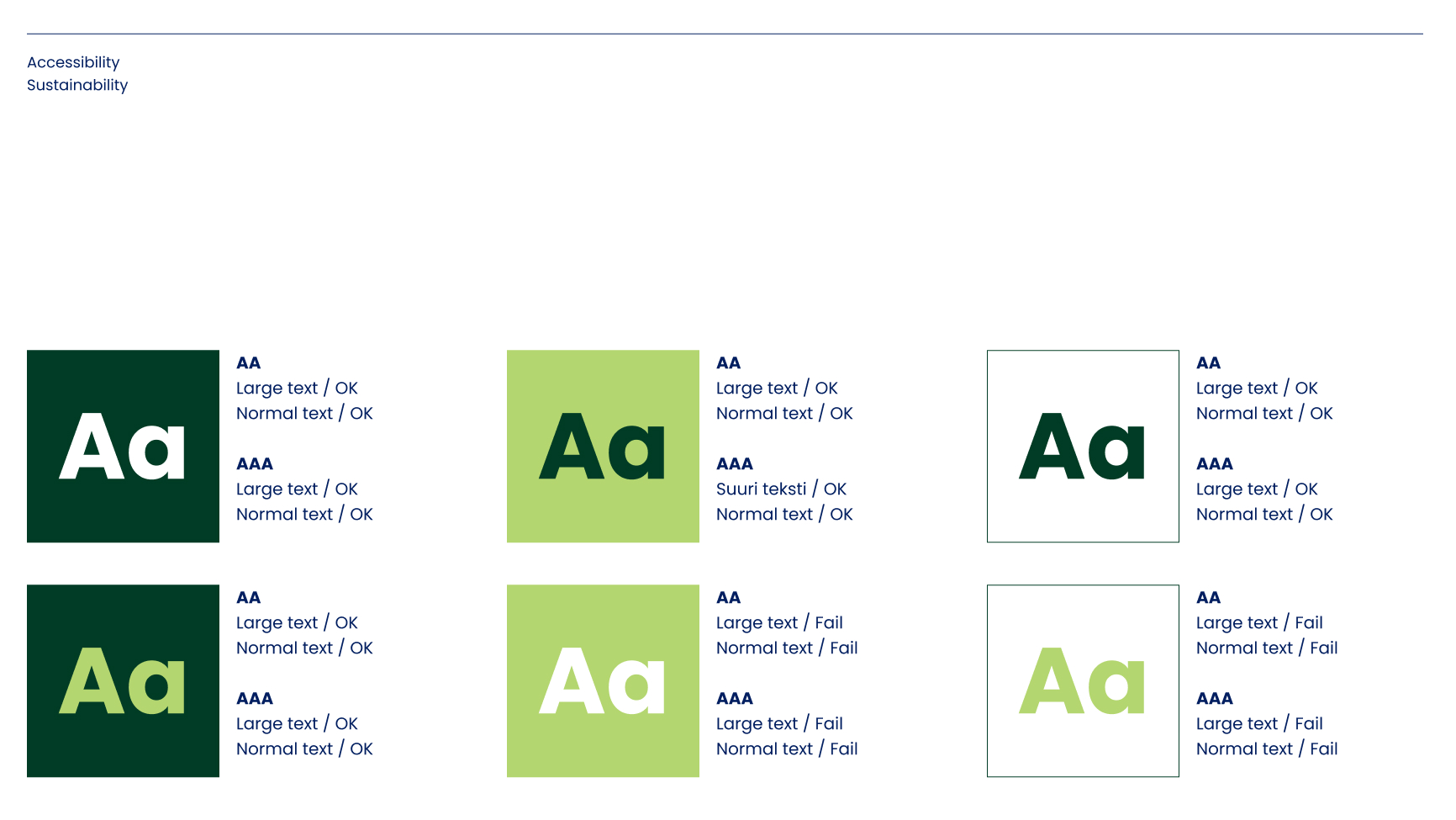
Accessibility
When designing content for the digital environment, the accessibility and readability of the text must be taken into account. A study has been made of the most common pairs of colours and their accessibility.