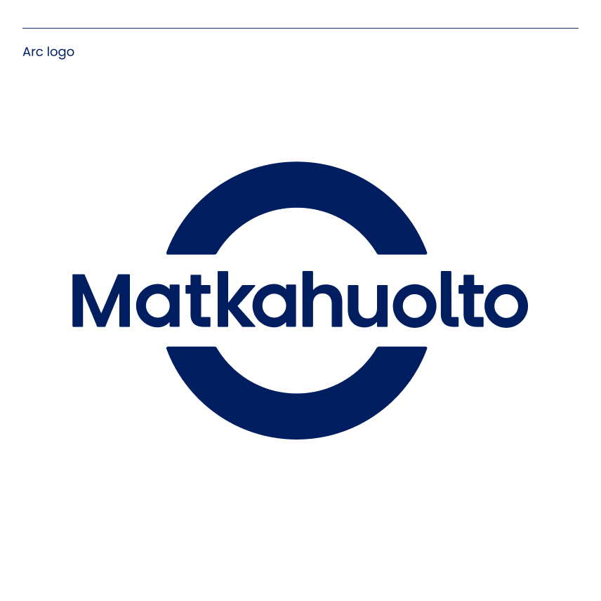
The updated logos honour Matkahuolto’s history through their simplified usability. There are two versions of the Matkahuolto logos, an arc logo and a text logo.
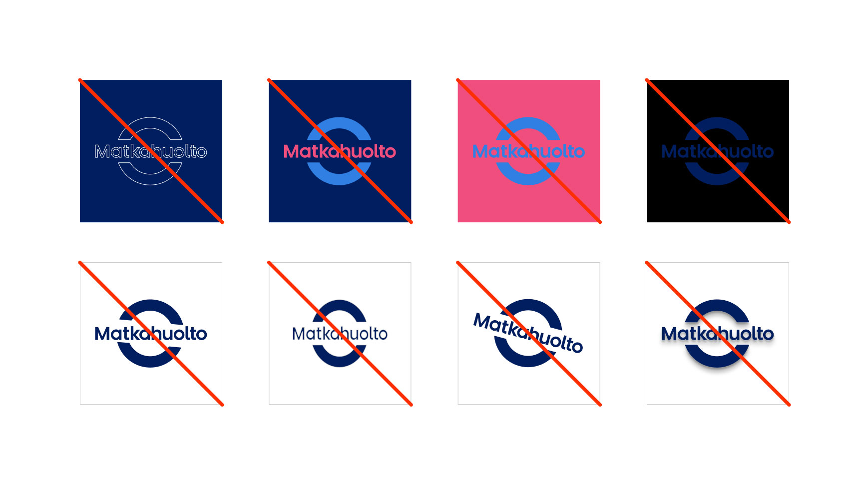
Always use the ready-made original logos. No changes should be made to the colours or design of the logos, and you should never attempt to construct them yourself.
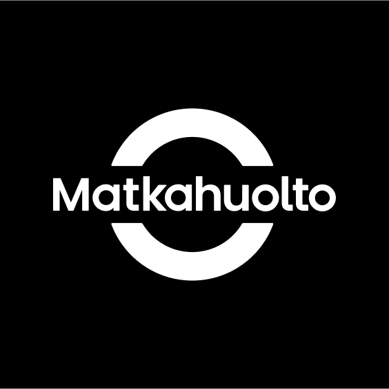
The primary arc logo consists of an updated text logo and the familiar arcs.
Always use the ready-made original logos. No changes should be made to the colours or design of the logos, and you should never attempt to construct them yourself.
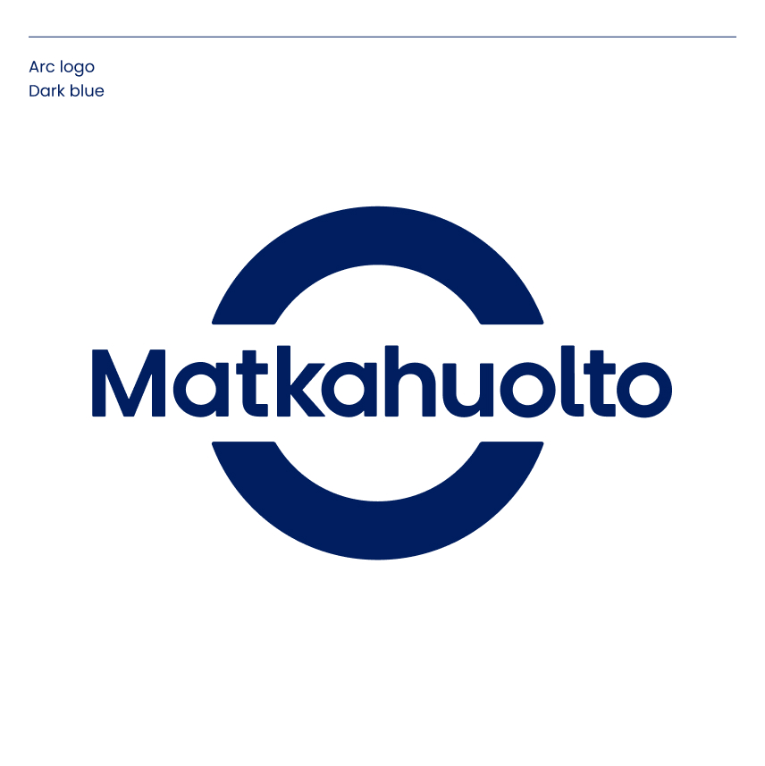
Colour versions
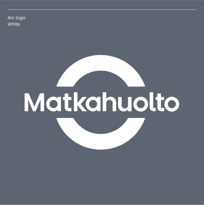
There are two primary colour versions of the arc logo: Matkahuolto’s dark blue and white.
Always use the ready-made original logos. No changes should be made to the colours or design of the logos, and you should never attempt to construct them yourself.
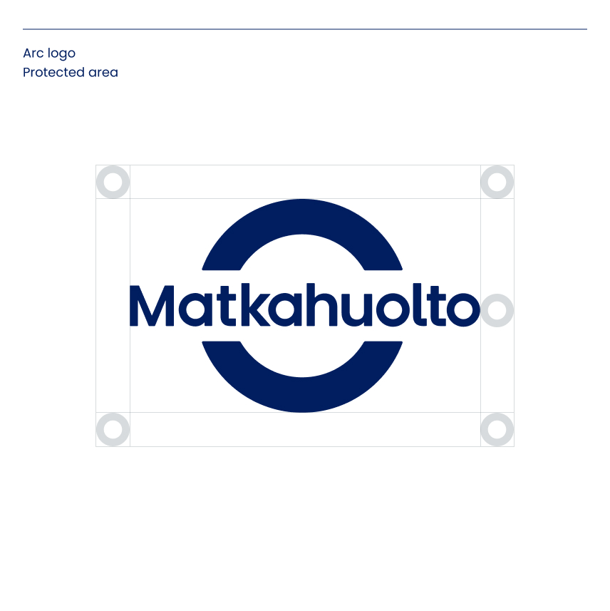
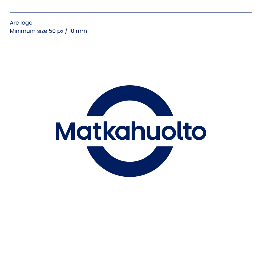
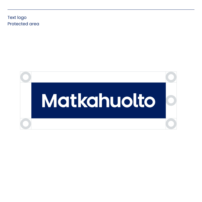
Protected area and minimum size
A protected area is an empty space around a logo, which is to be kept free from other visual elements. A minimum logo size has been specified for digital (px) and print media (mm).
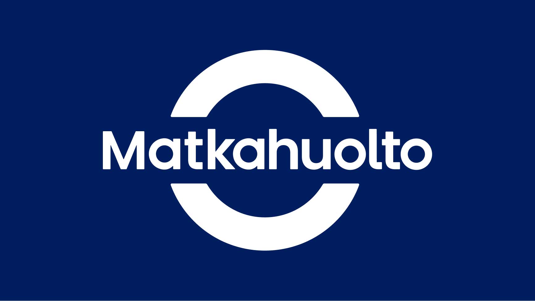
Use on colour backgrounds
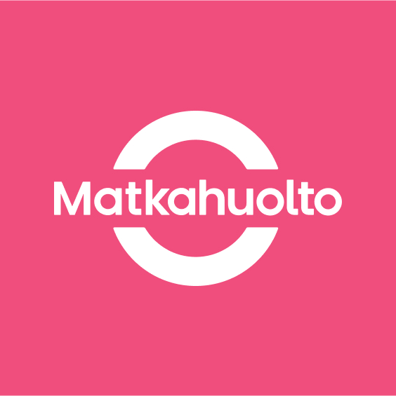
Matkahuolto’s arc logo is used primarily in white on all identity colour backgrounds.
Do not use the logo like this
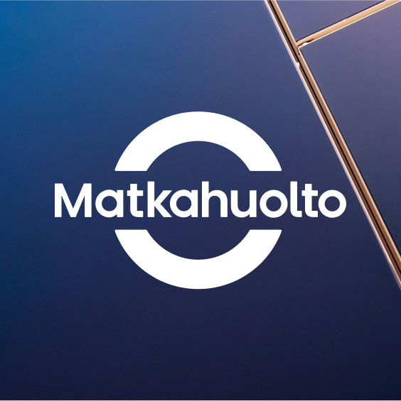
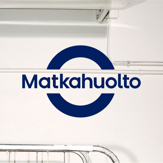
Use of the arc logo with a photograph
Preferably, use the white logo and make sure that there is sufficient contrast with the background. If the photo is so light that the contrast is not strong enough, the dark blue arc logo can be used as a secondary option.
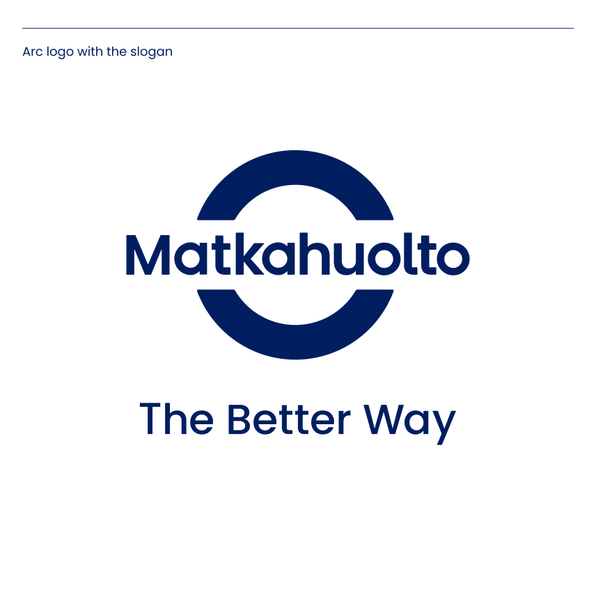
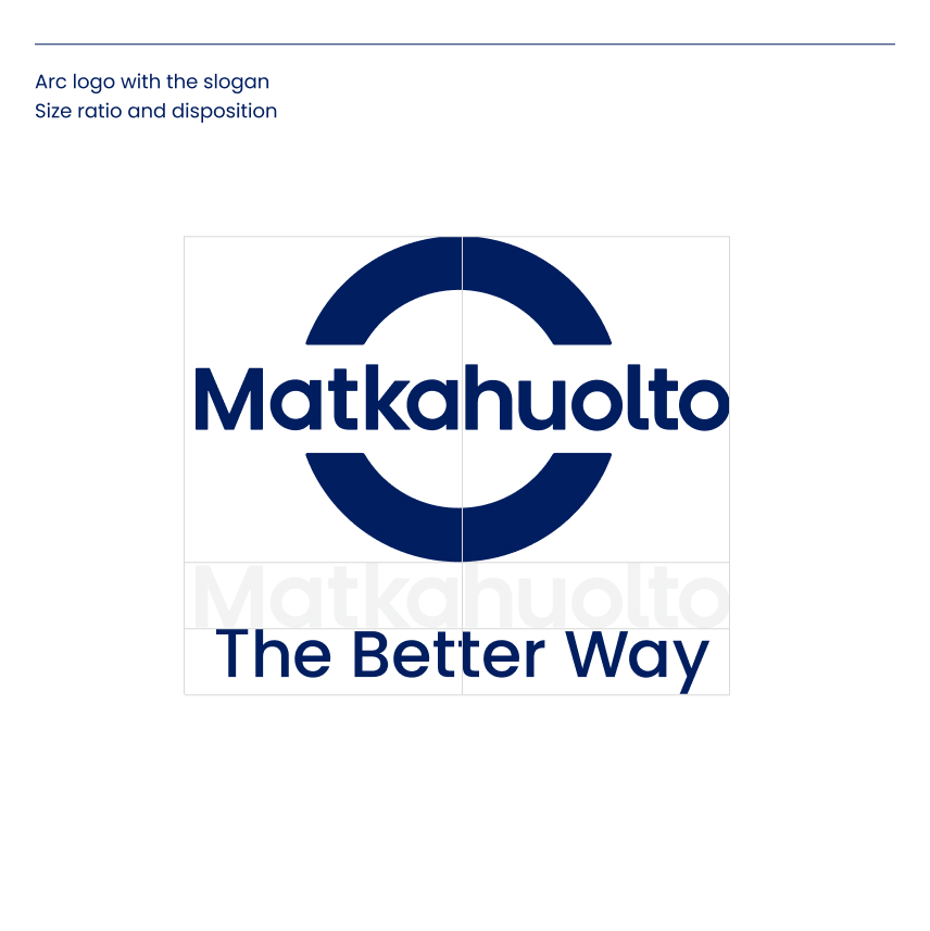
Use of the arc logo with the slogan
The arc logo and the slogan are primarily used separately on the same surface. If necessary, the logo can be used together with the “The Better Way” slogan.
A specific size ratio has been defined for the arc logo and the slogan. The purpose of the ratio is to make the hierarchical relationship of the elements more consistent, so that the arc symbol stands out as the primary one.
Always use the ready-made original logos. No changes should be made to the colours or design of the logos, and you should never attempt to construct them yourself.
The text logo is not used along with the slogan.
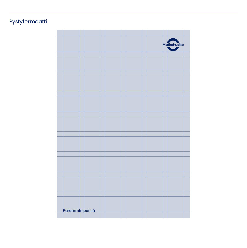
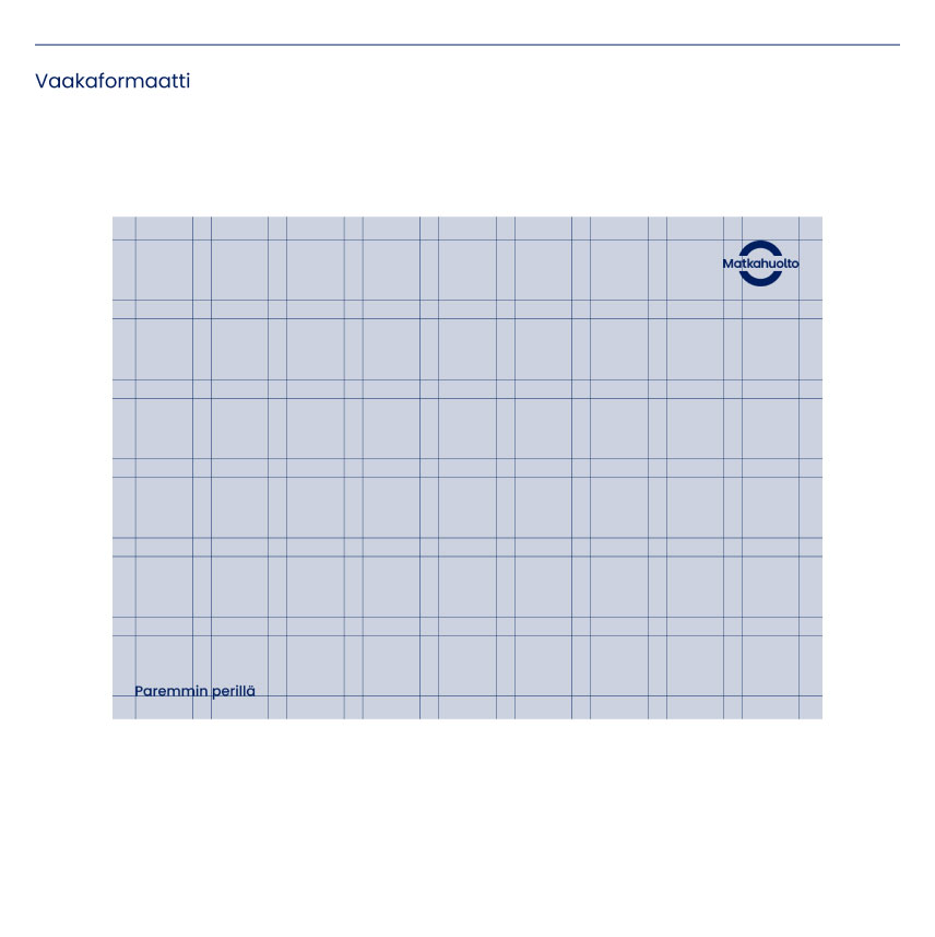
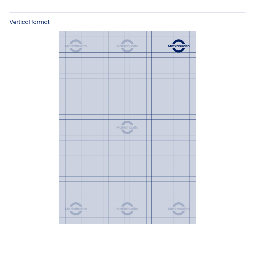
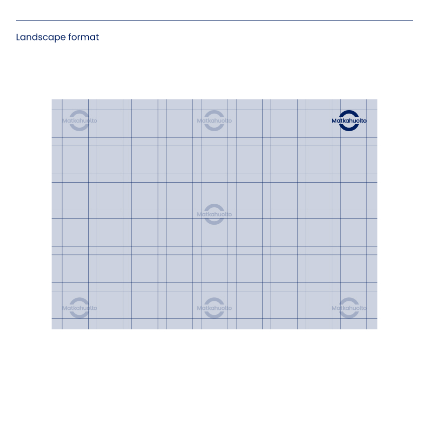
Preferred positioning of the logo
With standard formats such as A3, A4, A5, C4, C5, etc., corner-aligned composition is used to position the logo elements. Preferably, the arc logo and the slogan should be used separately when set on the same visual surface.
The positioning of the logo determines the distance of the slogan from the edges. When positioning the logo elements, always consider their mutual size ratio.
Preferred positioning of the logo without the slogan
When the slogan is not used, the arc or text logo may be positioned more freely. The logo can be placed in the corner or in the middle, depending on the media and design possibilities.
When positioning the logo elements, consider the size ratios so that the hierarchy between the different elements remains clear and the Matkahuolto identity is readily recognisable.
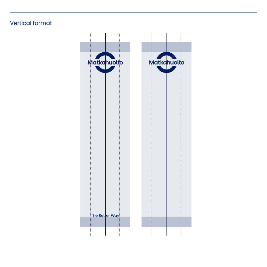
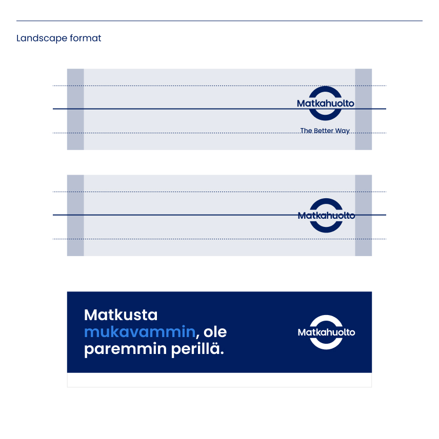
Secondary positioning of the logo
Exceptionally – as in the case of narrow vertical or horizontal formats – a vertically or horizontally centred positioning may be used to place the logo elements.
The size ratios between the elements must always be taken into account in layout design.
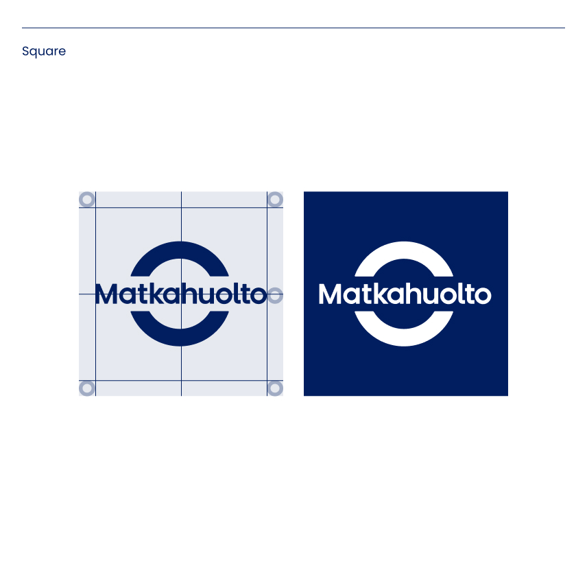
Square format
The following positioning model has been specified for the sole use of the arc logo in compact formats, such as social media profile pictures or office advertising signs.
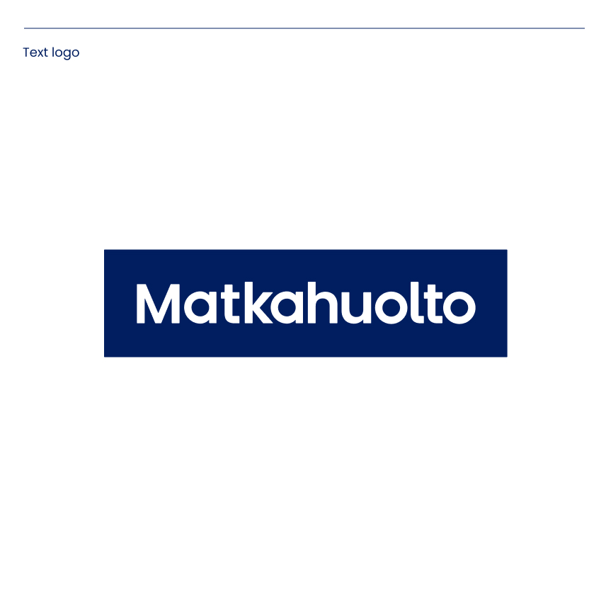
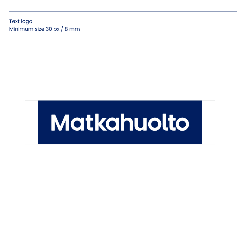
Text logo
The text logo is intended for secondary purposes. It is used in a less directly manner as a signatory and in cases where you want to subtly emphasise the company name, for example on the inside pages of presentations.
The text logo is not used along with the slogan.
Always use the ready-made original logos. No changes should be made to the colours or design of the logos, and you should never attempt to construct them yourself.
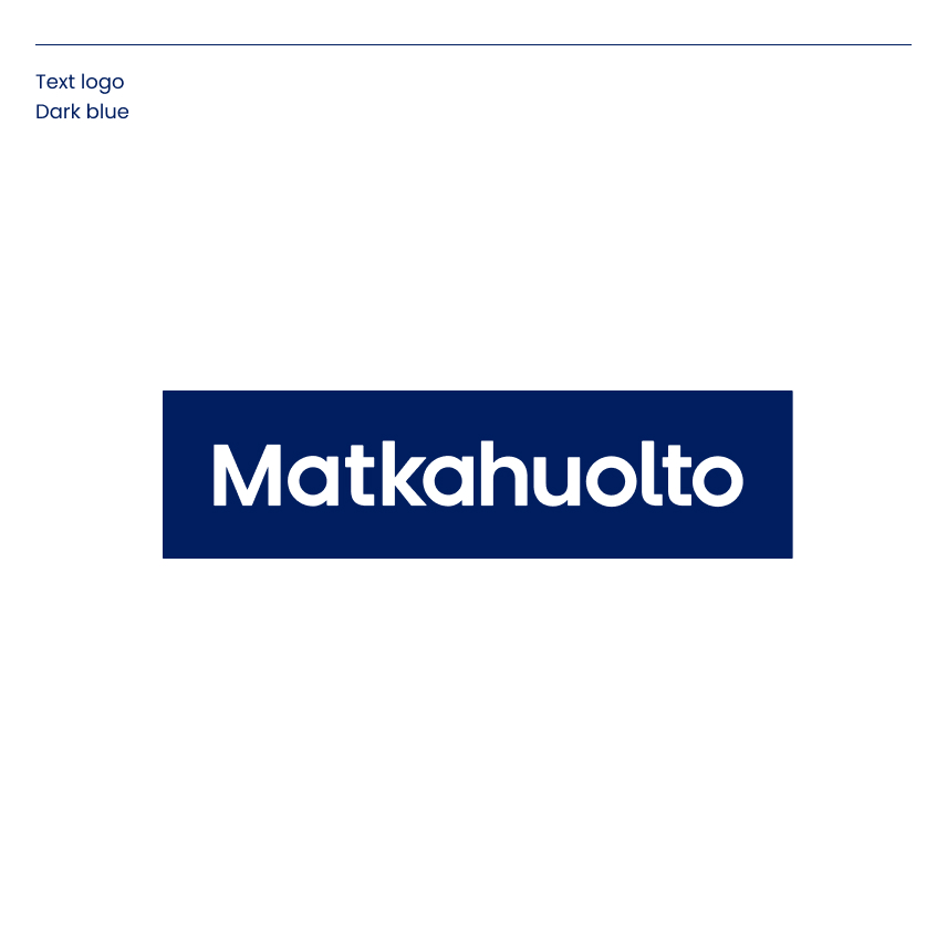
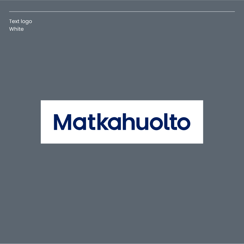
Colour versions
The dark blue version of the text logo is preferred. In applications where contrast is required (for example, where the text logo is on top of an image and the dark blue logo cannot be distinguished from the image), a text logo on a white background may be used.
Protected area and minimum size
A protected area is an empty space around a logo, which is to be kept free from other visual elements. A minimum logo size has been specified for digital (px) and print media (mm).
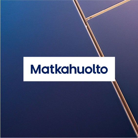
Use of the text logo with a photograph
The text logo can be used when it is not possible to use the arc symbol, for example when the photo is so restless that the arc logo in white cannot be seen properly.
Use the text logo on top of the photo, preferably on a dark blue background.
Alternatively, the text logo can be used on a white background when the dark blue text logo is not distinctive enough.