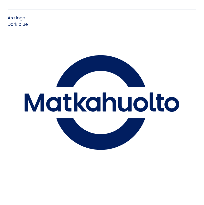
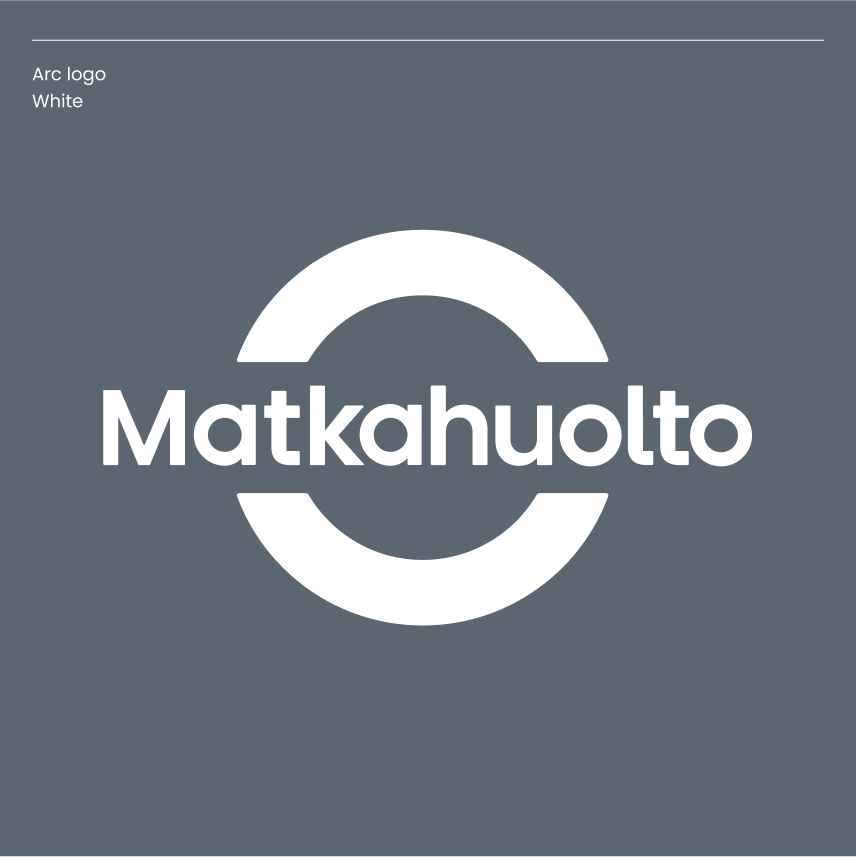
There are two primary colour versions of the arc logo: Matkahuolto’s dark blue and white.
Always use the ready-made original logos. No changes should be made to the colours or design of the logos, and you should never attempt to construct them yourself.
There are separate versions of the logo for digital and printed materials. Always use the correct logo depending on the implementation.
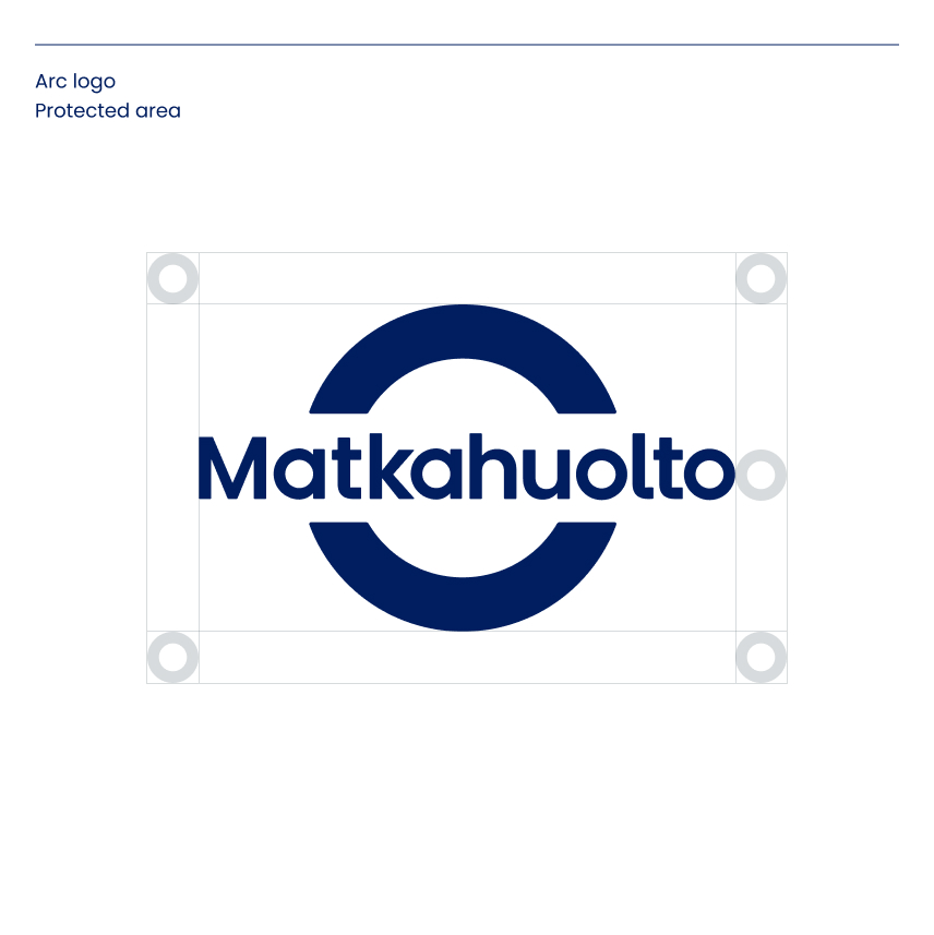
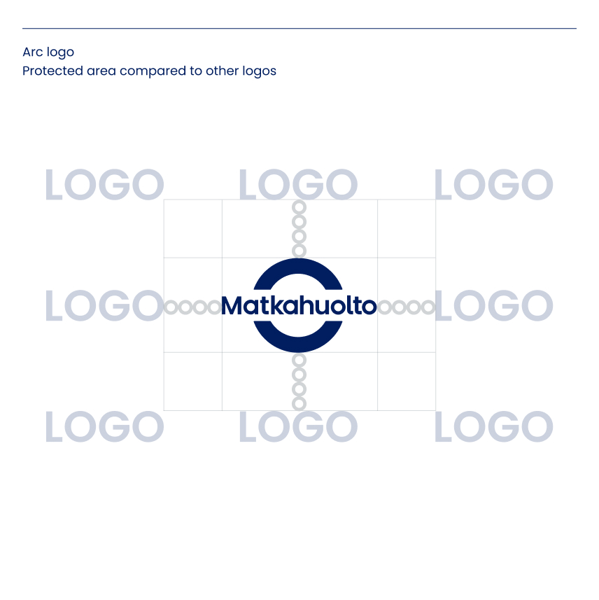
A protected area is an empty space around a logo, which is to be kept free from other visual elements. The protection area must be larger when the logo is placed near other companies’ logos.
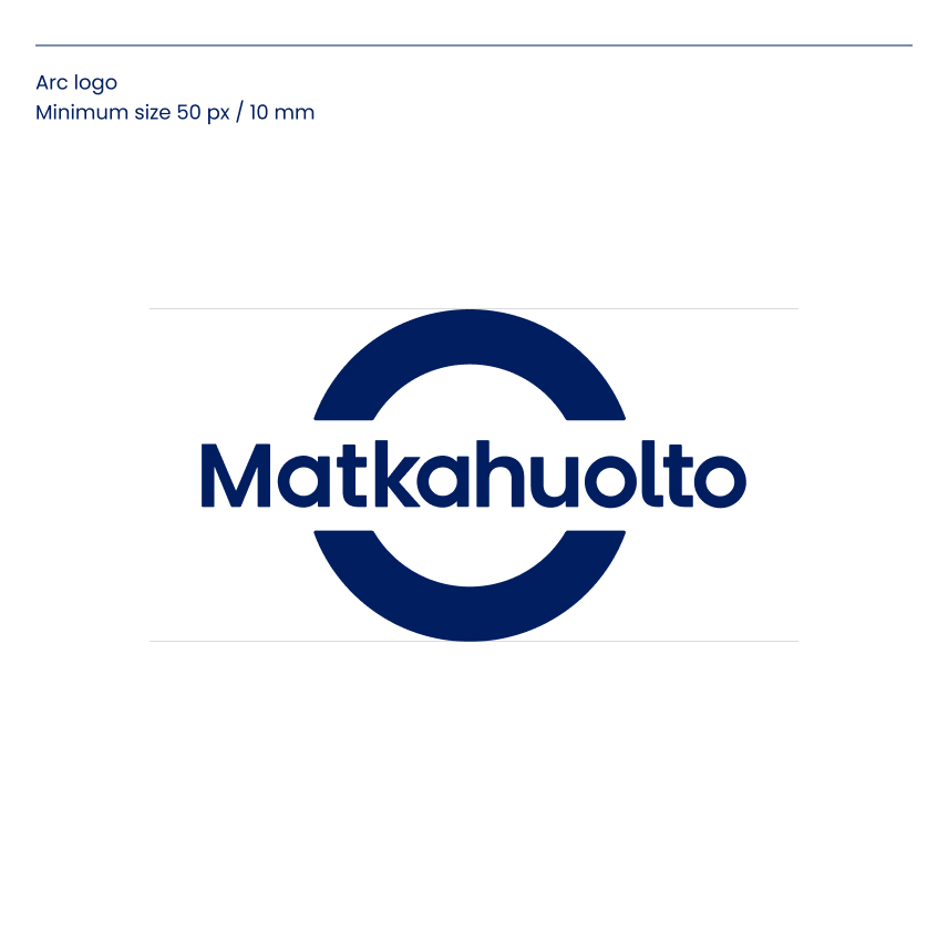
Minimum size
A minimum logo size has been specified for digital (px) and print media (mm).
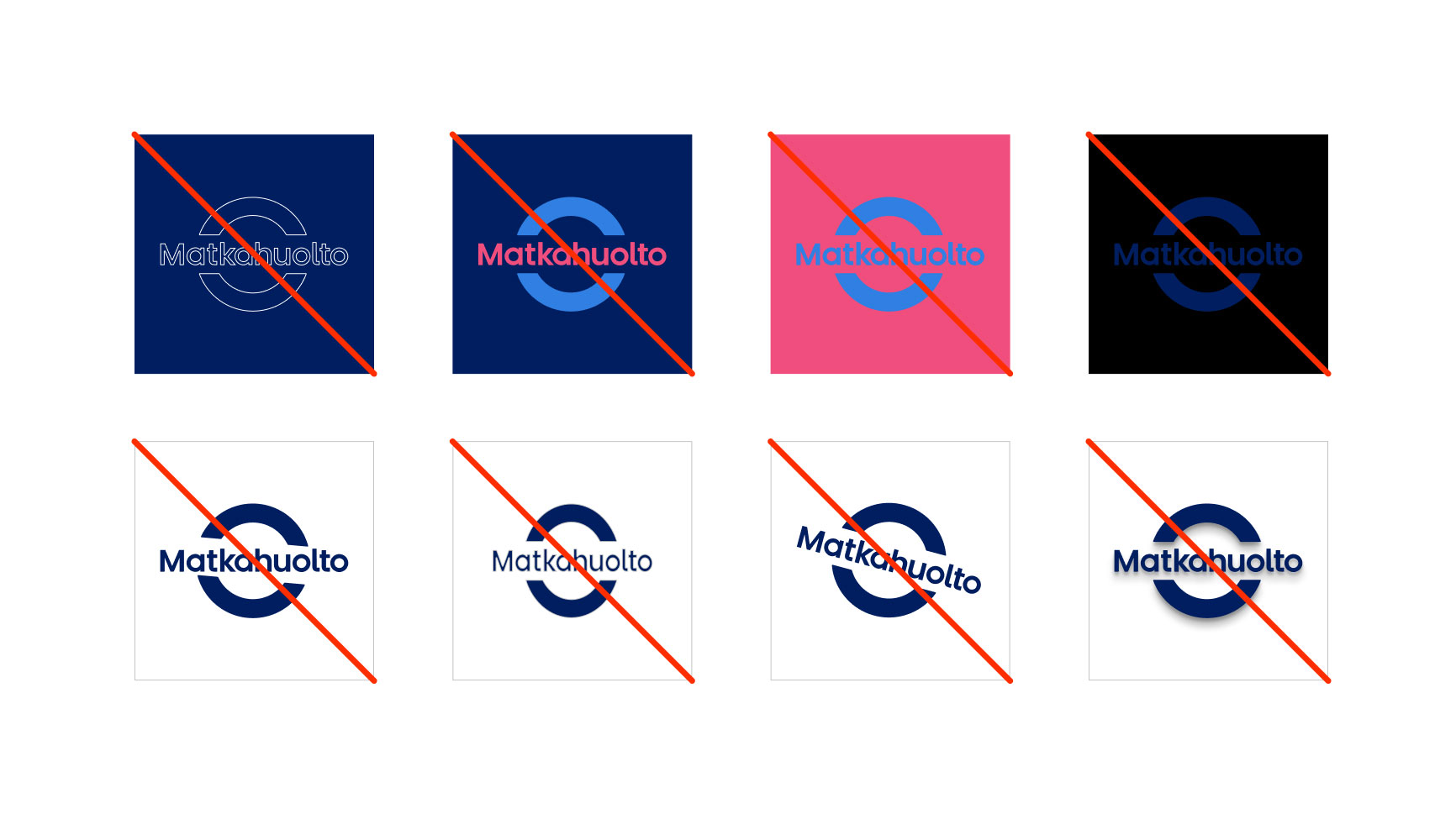
Do not use the logo like this
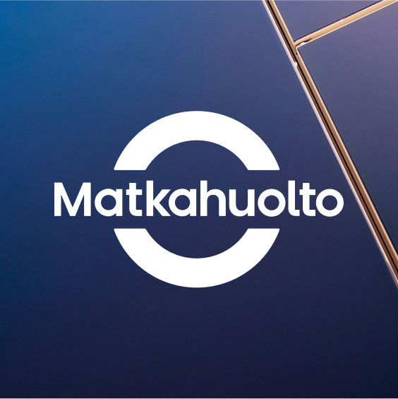
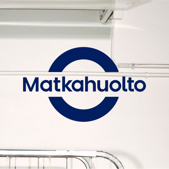
Use of the arc logo with a photograph
Preferably, use the white logo and make sure that there is sufficient contrast with the background. If the photo is so light that the contrast is not strong enough, the dark blue arc logo can be used as a secondary option.